Photo Source: Cat Wise / PBS NewsHour
I suppose I can call myself a reformed type enthusiast (mostly thanks to Kathy Walkup‘s “Visible Language” class at Mills). I used to stick mainly (okay, only) to polymer plates. Something about sitting there for hours with my back bent, taking fifteen minutes to create one line…yeah. But I now find it hard to say “Achk I hate type!” when I understand the history of the technology, and how it completely opened up the world of books, literacy, and the spreading of the written word. It’s hard to condemn something that is one of the greatest inventions in the history of mankind.
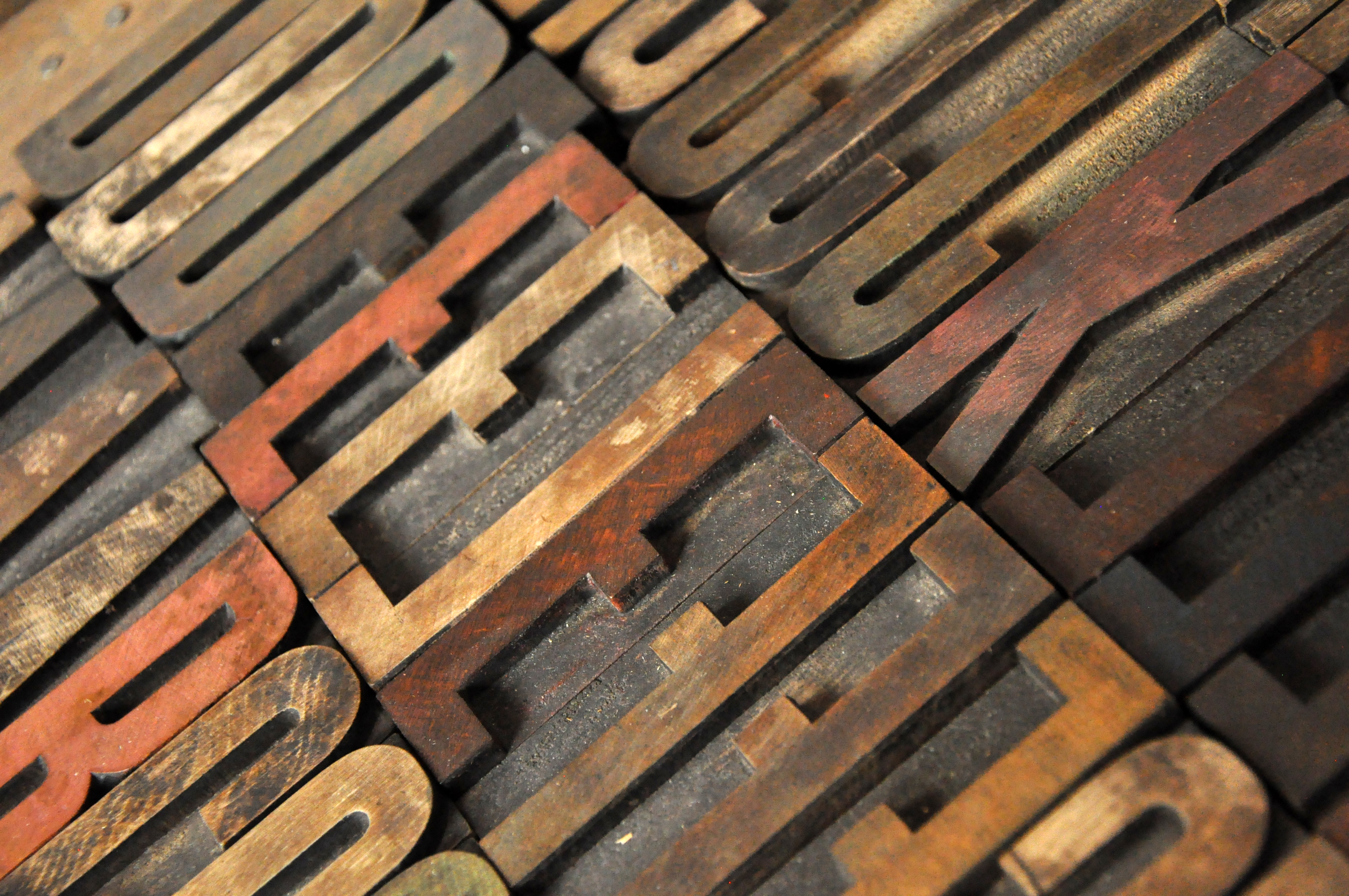
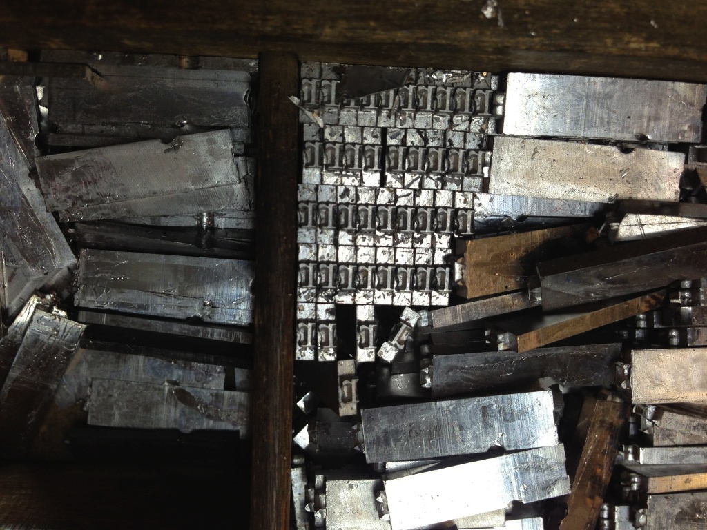
Photo source: www.acoloradocourtship.com
Anywho, my first segway into appreciating metal type was not through historical research, but through using and appreciating wooden type. There is something about wood type – it is large, so it feels more like a building block… it’s tangible. The letters are often imperfect, which actually gives them character and is often preferable to perfection (unlike lead type…damaged lead type is the worst. period.) With wooden type, the grain of the wood shows through. And as a relief printer, I love a good wood grain.
So recently I have found myself playing around with wood type. As with any creative project, it is much more sans-stress when you do not have a specific final product in mind. Then you cannot let yourself down. Then it doesn’t have to be perfect. And as someone who has a few OCD tendencies (okay, a lot), this kind of process is very freeing.
So here are some examples of what happened after playing around with some wood type on the letterpress:
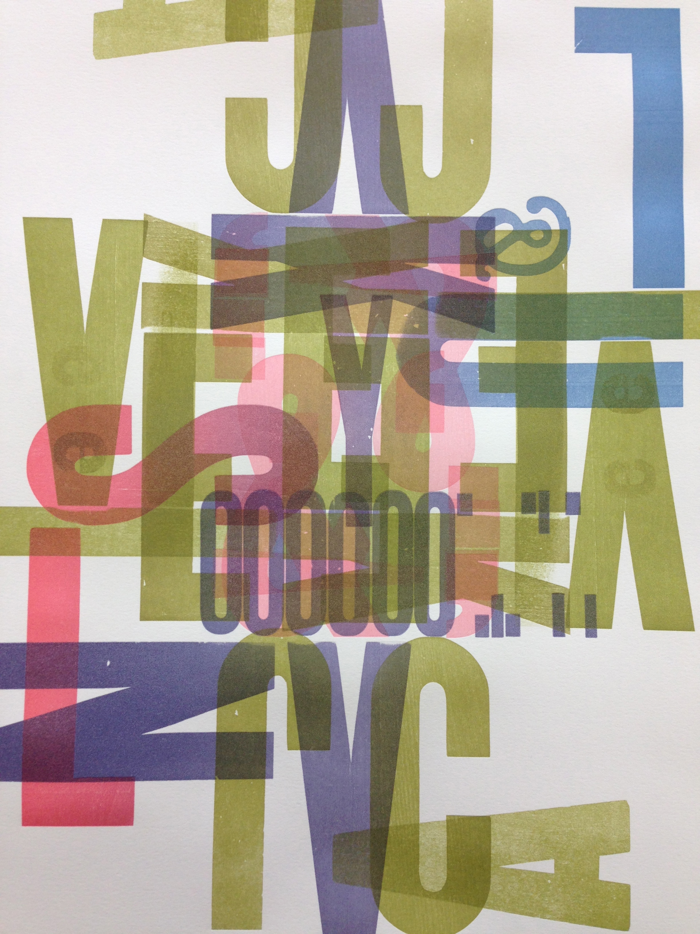
This piece is one of many collaborative prints done by our Visible Language class during a workshop with Dennis Ichiyama, an artist and professor known for experimenting with wood type. He told us about the Hamilton Wood Type & Printing Museum in Northern Wisconsin.
We had a lot of fun in the workshop trying to guess how a run through the press would alter the print… with frequent second passes after turning the sheet, we created some great symmetry!
_________________
————————-
a
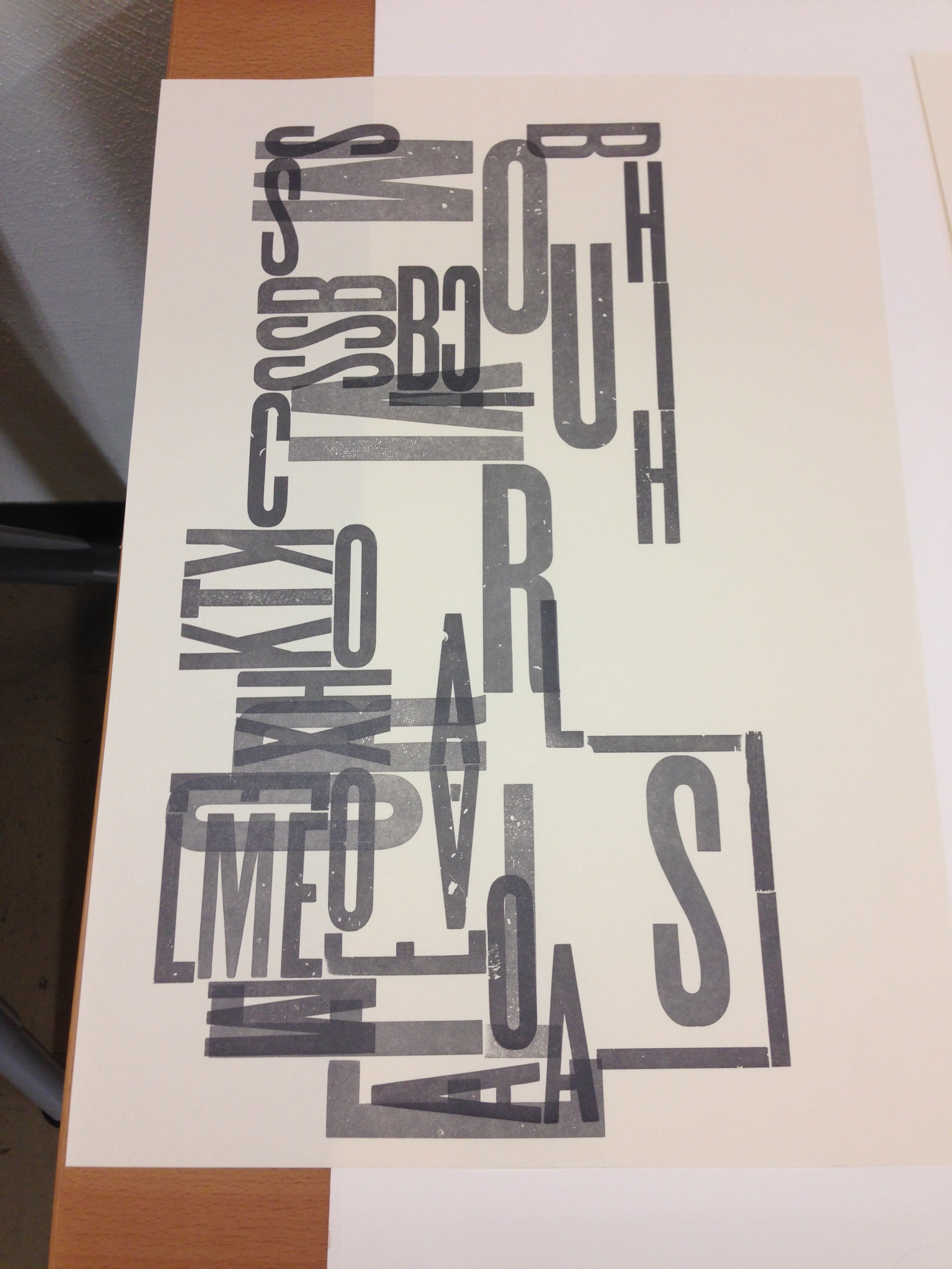
Here is a print I made that is meant to be a blueprint for our apartment. It took a little more planning (and I completely forgot it would print backwards… so it isn’t really our house after all!). I enjoyed creating certain relationships between rooms or areas and the letters that form them (like KTK for kitchen. and a giant S for “stuff,” because we are total hoarders).
———————————–
__________________
————————-
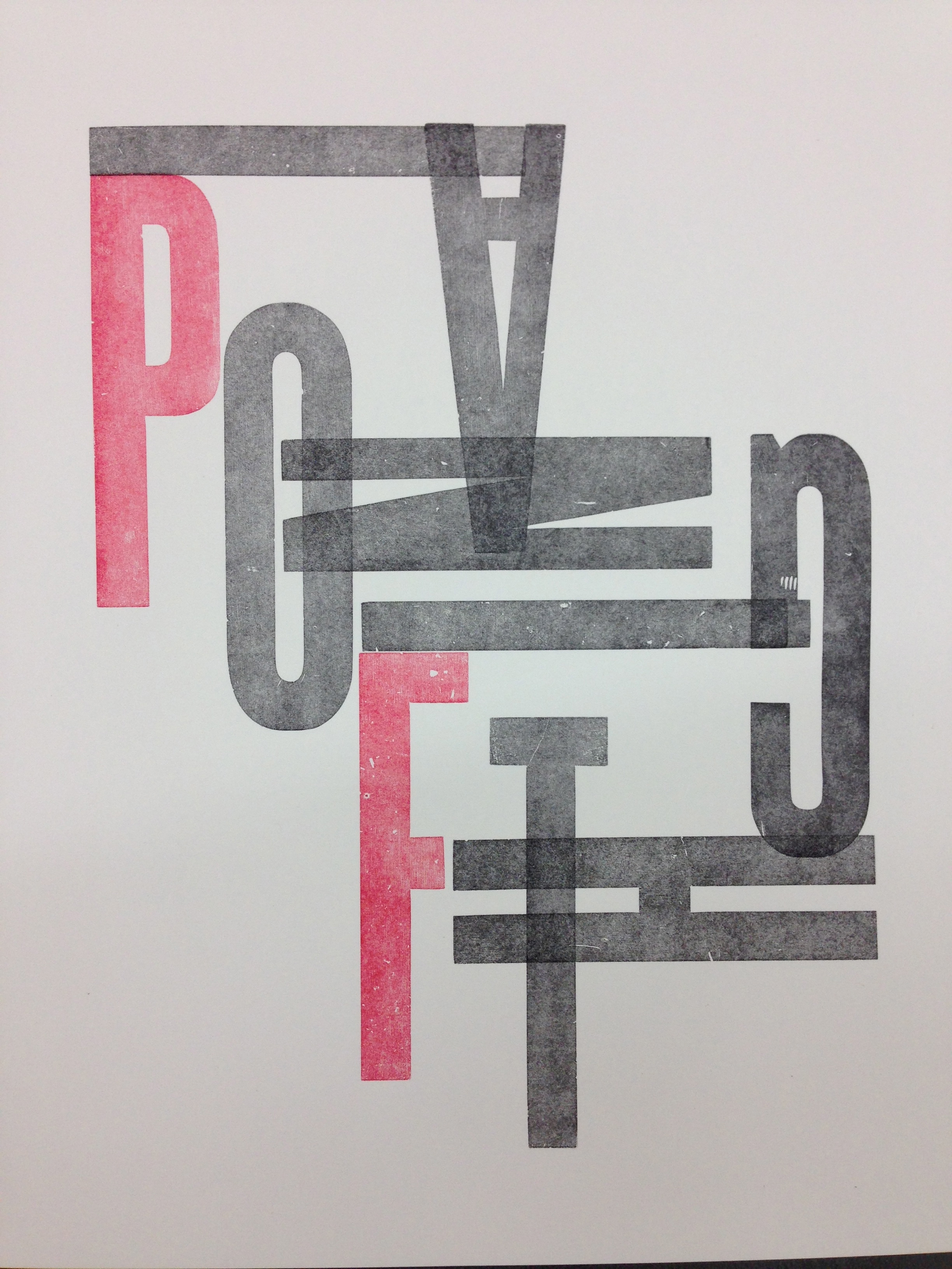
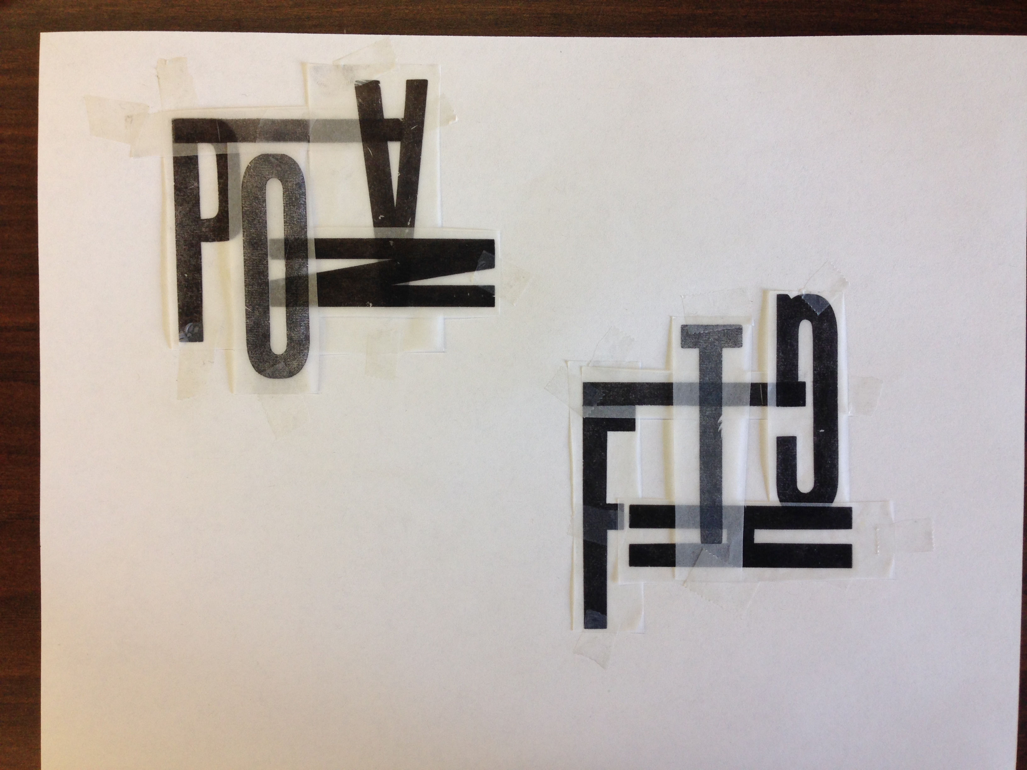
And, of course, I had to create one for Pianofight! I admit the preparation got a little tedious for this one, since it had to be so exact. But what helped considerably was having cut-out letters printed on transparent sheets, so that I could plan exactly how they would fit together. Super pleased with the end result.
———————————–
____________
____________
Also, just for kicks and inspiration, here are some cool wood type artists I found surfing/drowning in the internet just now:

http://www.lynneavadenka.com/prints.html
_______________
<< and this poster-making duo, Dirk and Carol Fowler: http://f2-design.com/store/
Hope you got something good out of my nerdin’ out sesh.
’til next time!
-A
